Summer is a time to rest, to disconnect, to not think about work, or at least ideally. We leave the offices to remote places, to places far away from our natural work environment. Places where we don’t have our usual computers or colleagues who can lend us a hand.
But sometimes duty calls; some report to fill out, approve an order that has been left pending or review invoices. Punctual tasks but that in many occasions need our connection to the business systems.
It is during these moments when the worker least wants to waste time in making costly connections, having to deal with endless processes and screens with thousands of fields that are never used.
Therefore, when processes are mobilized, it is not just a matter of making screens available remotely, but of rethinking the process for this new need. It is important to review what information is really necessary for the user and what should be reported. What is not essential, either eliminate it, or put it in secondary screens where the advanced user can navigate if he wishes to do so. In this way, we will gain agility when executing the process, since the user will focus on the relevant information and we will save on aspects such as transmitted data and responsiveness of our solution.
Especially in the design world we hear a lot about KISS (Keep It Simple Stupid) although Leonardo Da Vinci already said that “simplicity is the ultimate sophistication”. I for one truly believe in this statement; but in the case of process mobilization, it should be the motto.
Let’s imagine that we are on vacation on an island paradise, but we have to approve a request. On the screen we could have a text describing the request, with extensive information about what it is and who has requested it. Also a section containing the data about whether we approve it or not with multiple fields to give information about the reasons for the chosen option. It can be a very large screen to view on a mobile device (especially if you do it from a swimming pool).
Let’s suppose on the other hand that we have a screen with brief data about the request, with a link to obtain more information, and in the section that we must inform, there are no open text boxes but drop-down boxes with the most common options and with the ability to press a button to display more fields where more information can be entered. Surely the user will appreciate a simpler interface, containing the usual functionalities, but at the same time giving him the opportunity to get more data or more boxes to enter information if needed.
In a way, we offer simplicity, but at the same time, you can access as much information as you want. In this way we will make mobile solutions attractive and agile to users, without losing the possibility to access more complex functionalities.
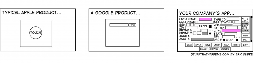
It’s time to rest, so let’s also keep this post simple, although I leave a small reflection. Google’s interface is really simple, but does anyone doubt the functionalities it can offer to those who want to exploit them? That’s the way.
Simplicity is the ultimate sophistication
Leonardo Da Vinci
1 thought on “Keep It Simple S*****”